Guide to Creating Pass Sonars in Tableau
Passing sonars are pretty cool, and useful visualisations to look at. Particularly in a team sense, they can tell us, at a glance, about their passing habits/tendencies.
They’re quite easy to create using Python or R, but can be done pretty conveniently using a combination of Excel and Tableau too. For this guide, I’ll use the Champions League game between Chelsea and Atletico Madrid as an example.
Step 1: Collect your data. What you’ll need here are the x-y locations (start and end) for all completed passes in the game, along with the name of the player who made each pass, something like this:
Assign a Unique ID for each pass, just by filling the first column with numbers from 1 to whatever the last number is (in this case, it’s 936).

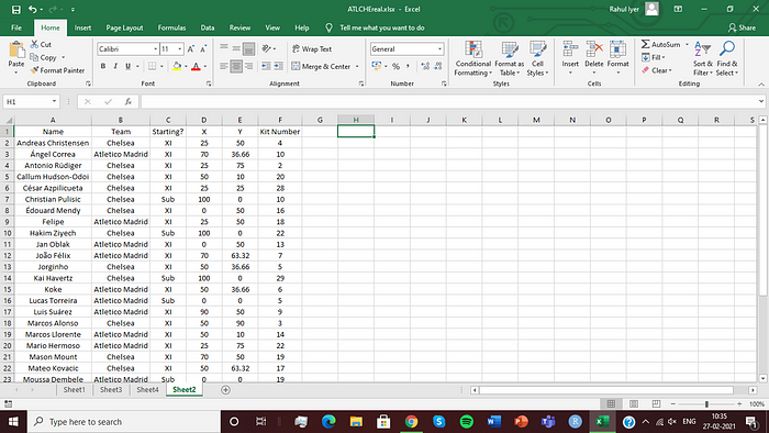
Step 2: Create the following database in a new sheet:

The ‘X’ and ‘Y’ columns here are basically the positions of the player on the pitch. You can set these coordinates depending on where they’ve been placed in the formation (just by having a look at the lineup).
Alternatively, you could use the average start location of their passes, but I’d advise against that as it leads to a lot of overlapping between points.
Also, including substitutes is optional. I won’t be using them here, just the starting XIs, but I’ve put them in here for you to see that they can be included.
Important: When you’re done creating the database, remember to sort it in ascending order of the players’ names. This needs to be done, because we’ll be using Excel’s LOOKUP function, for which this is a prerequisite.
Step 3: Go back to the first sheet, and from column F onwards, enter the following column headings, and copy the respective formulas into the cells just below the heading. If you just want the method, you can just copy these in. For an explanation of the maths behind it, there’s one at the end of this piece.
Pass Length: =SQRT(POWER((E2-C2),2)+POWER((D2-B2),2))
Slope: =(E2-C2)/(D2-B2)
Angle: =IF((D2-B2<0,180+ATAN(H2)*57.2958,360+ATAN(H2)*57.2958)
Bin: =IF(I2>360,1+INT((I2–360)/36),1+INT(I2/36))
Avg Bin Length: =AVERAGEIFS($G$2:$G$937,$J$2:$J$937,J2,$F$2:$F$937,F2)
Bin Frequency: =COUNTIFS($J$2:$J$937,J2,$F$2:$F$937,F2)/COUNTIF($F$2:$F$937,F2)*100
Start X: =LOOKUP(F2,Sheet2!$A$2:$A$32,Sheet2!$D$2:$D$32)
Start Y: =LOOKUP(F2,Sheet2!$A$2:$A$32,Sheet2!$E$2:$E$32)
del X 1: =(K2/3)*COS((J2–1)*(36/57.2958))
del Y 1: =(K2/3)*SIN((J2–1)*(36/57.2958))
del X 2: =(K2/3)*COS(J2*(36/57.2958))
del Y 2: =(K2/3)*SIN(J2*(36/57.2958))
END X 1: =M2+O2
END Y 1: =N2+P2
END X 2: =M2+Q2
END Y 2: =N2+R2
Starting?: =LOOKUP(F2,Sheet2!$A$2:$A$32,Sheet2!$C$2:$C$32)
Real X: =IF(AA2=1,M2,IF(AA2=2,S2,IF(AA2=3,U2,M2)))
Real Y: =IF(AA2=1, N2,IF(AA2=2,T2,IF(AA2=3,V2,N2)))
Team: =LOOKUP(F2,Sheet2!$A$2:$A$32,Sheet2!$B$2:$B$32)
After using these formulas in the first column, copy-paste them for all the rows in the dataset.
For the last column, named ‘Path’, set it as 1 for the entire dataset. Then copy-paste the data just below it and change it to 2 for the copy. Copy-paste again, and change it to 3 this time.
If all goes well, you should have something like this (for the first row, just copy-paste them till the end of the dataset):

Step 4: Now, to create the visualisation. Load up Tableau and connect to your Excel file.
Drag ‘Real X’ onto columns and ‘Real Y’ onto rows. Change them both to dimensions.
Add filters for ‘Starting?’ and select XI, and ‘Team’ and pick the team whose sonars you want to represent (I’ll go with Chelsea here).
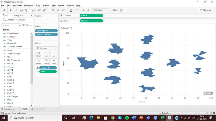
Change the mark type to Polygon. Drag ‘Path’ onto Path (change it to dimension), and drag ‘Unique ID’ onto detail.
You should have something like this:

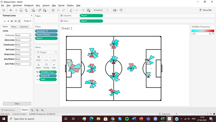
Now, go to colour and set the border as black. Also, drag ‘Bin Frequency’ onto colour, and set that to whatever colour scale you want. I went with a cyan to red one, going for a ‘cold zone’ to ‘hot zone’ kind of thing. After doing that, you should have this:

Next, go to the ‘Map’ tab and add in your pitch as a background image. Set the limits for the X and Y fields for the image as -10 to 110, for both. Double click on both your axes and set them to the same range.
Right click in the graph area, go to format and set the background colour to none. Disable all the lines as well. Finally, right click on your axes and deselect the ‘Show Header’ option. It should now look like this:

Now, open a new sheet and connect it to the Excel sheet which contains your player database.
Drag ‘X’ onto columns and ‘Y’ onto rows. Apply the same filters you did on the previous sheet. Choose the mark type ‘circle’ and increase the size to a reasonable one. Again, fix the axes to go from -10 to 110. Hide the headers and format the sheet just like the previous one. If it looks like this, well done:

Notice that I haven’t added in the pitch here. You can if you want, but when putting the 2 sheets on a dashboard together, it might hide a little bit of the sonars here and there. That bothers me personally, but if you’re okay with it, then go ahead.
For the last step before assembling the 2 on a dashboard, drag ‘Kit Number’ onto label, and format the font and alignment to get each label in the centre of the circle, like so:

Now, open a new dashboard and add both sheets to it (Sheet 2 on top of Sheet 1). You’ll have to play around a bit with the size and position of Sheet 2 to get it aligned properly, but if you do it once, you can just note down those values and use them later on if you need to. You should have this once you’re done:

After this, add in your own customisations and legends, and you’re done! Here’s my finished product:

As always, feel free to reach out by leaving a comment here, or contacting me on Twitter (@RahulIyer32).
How the Magic Happens (aka, Nerds Assemble!)
So, here I’ll provide an explanation of the formulas used. I promise I’ll try to keep it short, and if you feel like, when you’re putting this into practice, some of it feels extraneous/unnecessary/roundabout, feel free to use your own methods or shortcuts!
Essentially, what we’re doing with a pass sonar is collecting all the passes made by a player, centring them at one point and bunching them together.
I’ll go through the categories one by one now:
Pass length: Simple calculation of the distance between 2 points.
Slope: We need this to calculate the angle of the pass. And for any line, the slope is the vertical change in coordinates divided by the horizontal change in coordinates. Easy enough.
Angle: This is where it gets a bit sticky. If we just use the inverse tangent (remember high school trig?) to get the angle, we’ll get only the positive angle, or one in the 1st or 4th quadrant. Basically, it doesn’t cover all 360 degrees, so the conditions added in there make sure that we do get those angles. You can try it out for yourself too, and see what comes out. You’ll only get points to the right of where your player is. Also, the multiplication of 57.2958 means that I’m getting the output in degrees. If you’re comfortable working with radians, then you don;t have to use this.
Bin: This is how we split the passes into different groups. The 36 I’ve used there is how many degrees I want each section to cover. So here, I get 10 sections. You can change this according to your preference, obviously, depending on whether you want larger or smaller sections. Remember, though, if you used radians previously, you’ll need to input the radian equivalent of 36 degrees here.
Avg Bin Length: The average length of passes made in that bin, by that player.
Bin Frequency: The number of passes made in that bin by that player, as a percentage of the total number of passes made by that player.
Start X & Start Y: The X and Y coordinates from where we want all the pass groups to start, or spread out from. This is just the player’s position on the pitch, and because we’re using the LOOKUP function, we need to arrange the player database in ascending order.
del X 1 & del Y 1: These are measurements for how far away from the starting point we need the pass groups to end. Here, ‘1’ means, that this is basically going to tell us how far away from the starting point the initial boundary for the group is going to be. This is basically given by the average pass length for the bin multiplied by the relevant trigonometric function of the bin’s angle. (I’ve ‘shrunk’ the length proportionately here, so that the graphic doesn’t get too big and unwieldy).
del X 2 & del Y 2: Like the previous measurements, these will tell us how far away the final boundary for the pass group/bin is going to be.
All the END points: These points are the final points where the bin boundaries are going to end, just the starting points plus the amount of deviation (the del measurements).
Starting? & Team: These are just obtained using the LOOKUP function again, and are pretty self-explanatory.
Real X & Real Y: These values are basically obtained by telling the system to use Start X & Start Y values if the path is 1, del X 1 & del Y 1 if the path is 2 and del X 2 & del Y 2 if the path is 3, so it plots all these points at the same time on Tableau.
