Guide to Creating Passing Networks in Tableau
Passing networks are pretty cool graphics in general. It’s probably best to use a coding language, like Python or R to make them, but assuming you’re like me and have no idea what all that’s about, here’s a guide to making them in Tableau.
(Disclaimer: The entire process involves a LOT of Microsoft Excel. So it’s probably best if you have at least a basic knowledge of both Tableau and Excel before attempting this.)
This guide is going to have two main sections: Data Processing and Data Visualisation.
Data Processing
(Before you start, you will need to collect data for the match you want to analyse, and save that as an Excel file. The main parameters you’ll need are team identifiers, player identifiers, event qualifiers and X-Y coordinates for the event locations. You’ll also need to get the time when the events took place.)
This part is where most of the work is going to be done. It might be a little long, but the aim here is to do as much processing as possible in Excel, so all we have to do in Tableau is drag & drop, and tinker with the aesthetics.
- Go ahead and open up your file with the XY co-ordinate match data in it. Copy the following columns, along with the ones named endX and endY into a new sheet:

2. Now, what we’re trying to do here is establish which player is the passer and which one is the receiver for each successful pass. So, give the headings ‘Passer’ and ‘Receiver’ to 2 new columns. Paste the following formula in the first cell under the passer column.
=IF(AND(E4=”Pass”,F4=”Successful”), G4, “-”)
Basically, this formula tells Excel to return the value in the player ID column, if the event is a successful pass. Straightforward enough.
3. Paste the following formula in the first cell under the receiver column:
=IF(AND(E4=”Pass”,F4=”Successful”,A5=A4), G5, “-”)
Now, since the data source doesn’t explicitly state who the receiver of the pass is, we need to infer it ourselves. This formula tells Excel to return the player ID of the player performing an action just after a successful pass, IF they are on the same team of the passer.
4. Drag these formulas all the way down to apply them to each row in the data.
Note: There is a slight hitch you may run into here, which is that for some cases, you will get the passer, but the receiver column will have returned “-”.
Because there are usually just a few of these (6 or 7), you can leave them out if you feel they won’t make much of a difference. If you want to include them though, you can fix those manually (shouldn’t take more than 2 minutes), by filtering the receiver column to show only the cells with “-”. You can then replace those values with the right ones.
5. After you’ve done this, I would recommend filtering the data so that you just get successful passes. Copy that data and paste it in a new sheet, using the “paste values” option (the clipboard icon with the 123).

6. Now, to get the names of the players from their IDs, we’ll need to use Excel’s LOOKUP function, in combination with the list of players’ names we’ve copied into a separate sheet.
(IMPORTANT: In the players’ list sheet, sort the data in ascending order of player ID. This needs to be done for the LOOKUP function to work properly.)
7. Use the following formula to extract the player names:
=LOOKUP(J2,’Player Database’!$A$2:$A$23,’Player Database’!$B$2:$B$23)
If you know how the LOOKUP function works and how to use it, you can skip this paragraph, but I’ll try to give a brief explanation. Basically, the way the function is structured is like this: You give the system a value that it needs to look up, the range of cells where it needs to look for that value, and then the range of cells from where you want the system to output values. If you followed all the previous steps exactly, then these specific values should be the ones you have too. Just make sure that instead of ‘Player Database’, you put in the name of the sheet where you’ve saved the information on which player corresponds to which number. If you need a better explanation, a simple Google search should do the trick.
8. Repeat step 7, but for the pass receiver. Again, once you’re done, copy and paste only the values in the same spot. If all goes well, you should end up with something that looks like this:

Just leave that sheet be for now.
9. Go back to your player database sheet, and in 2 new columns, enter the headings “Avg X” & “Avg Y”. In these columns, we’re going to obtain the average positions of all the players, based on their touch locations. What I usually do here, is copy exactly what I need for this from the original data source, into a new sheet:

Here, before copying, use the ‘Sort & Filter’ button (top right) and make sure that the ‘isTouch’ column contains only ‘true’ values. Paste your copied values in a new sheet.
10. Back to the Player Database sheet now, and use this formula to get the average X location of each player’s touches:
=AVERAGEIFS(‘Copy of data (touches)’!$B$2:$B$1291,’Copy of data (touches)’!$E$2:$E$1291,A2,’Copy of data (touches)’!$D$2:$D$1291,”<=64")
This formula tells Excel to take the average of a set of values, based on certain conditions we input. So here, we’re telling it to take the average of the X-co-ordinates, when the player ID matches the one in the row we’re inputting this formula, and when the minute is less than or equal to 64, which is when the first substitution was made. Depending on what match you’re looking at, you’ll need to change this. Of course, change ‘Copy of data (touches)’ to whatever you’ve named your sheet with the duplicate values for touches. Copy the formula to all the relevant cells in the column. When you’re done, copy and paste the values in the same spot, like you did before.
11. Repeat this for the Y-co-ordinates. Remember to follow the correct order of entry for each of the terms in the AVERAGEIFS function, and change B to C, providing that’s where your Y co-ordinate data is.
Since we’ve set the minute limit to 64, substitutes will not have any data (you’ll see a #DIV/0! error). Just delete those rows, you won’t need them. The starting XI is enough. Again,
12. Put down each player’s team in a new column, and their kit number (this isn’t necessary, but I find it helps while putting the viz together).
PAUSE: Quick Progress Report
So, what we’ve done so far is extract the passer and receiver of each pass that was completed in the game, and calculate the average position of each player on the pitch. But how does this help us create a passing network?
Essentially a passing network is just a pass map, but with a fixed set of pass combinations. So, each player combination is just a specific type of pass, with a different size. This next part, the last bit of data processing, will help you organise the data in a way that makes it easy to work in Tableau.
Organising the Data into a Network:
- Copy all the players from one team into a new sheet, under the heading ‘Passer’. Make a total of 11 copies in the same column. In the next column, title it ‘Receiver’ and copy each player’s name 11 times, like this:

Do you see what we’ve done? The aim here is to create a matrix of sorts, with all possible player combinations.
2. Input the team name for each player (click and drag to copy along the full length of the column) and repeat the process for the opposing team, pasting the data in the same 3 columns, just below what you’ve already got. After this, input numbers from 1 to whatever the last one is (click and drag to fill) under the heading ‘unique ID’.
3. To input the number of passes, use the following formula:
=COUNTIFS(‘Pass Info’!$L$2:$L$785,B2,’Pass Info’!$M$2:$M$785,C2, ‘Pass Info’!$D$2:$D$785,”<=64")
This tells Excel to count how many instances there are of the passer and receiver being the same ones in this sheet as the ones in the sheet with your passing data (mine is called ‘Pass Info’, use whatever your sheet name is). Copy this throughout the ‘Passes’ column to get the number of passes made with each pair of players.
4. For the next 4 columns, apply the LOOKUP function as we did before. The Start X and Start Y locations need to be the Avg X and Avg Y values of the player in the ‘Passer’ column, and End X and End Y need to be that of the player in the ‘Receiver’ column. Keep in mind, the column where the system needs to search has to be arranged in ascending/descending order (even if it’s text). Again, a Google search of the LOOKUP function should help if you encounter any difficulties.
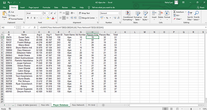
5. Back in the ‘Player Database’ sheet, calculate the number of passes completed using:
=SUMIF(‘Pass Network’!$B$2:$B$243,B2,’Pass Network’!$E$2:$E$243)
‘Pass Network’ being the sheet we just used. This function tells Excel to sum the number of passes completed, if they were made by the player in question. Repeat for number of passes received.
It should look like this once you’re done. ‘Total’ is just passes completed plus passes received.
6. Under the heading, ‘Path’ input 1 for the entire dataset. Then, copy everything and paste it just below what you already have. Change the ‘Path’ for this copied data to 2.
7. To get Real X , use this formula:
=IF($J2=1,F2,H2)
This just means that if the ‘Path’ is 1, the value of Real X is ‘Start X’ and otherwise (i.e., if it’s 2), it is ‘End X’.
8. Repeat this for the Real Y values. As always, once you’re done, copy the data and paste them as values in the same spot.
Putting the Visualisation Together:
It gets pretty straightforward from here.
You can use the same Excel file to connect to Tableau, but I tend to copy the 2 sheets I need (‘Player Database’ and ‘Pass Network’) into a completely different file and use that, just so I don’t get confused.
- Load up your player database sheet first, and drag Avg X onto Columns and Avg Y onto Rows. Use Team name as a filter and select just one team at first. Drag ‘Total’ onto colour and Kit Number onto Label.
- Next, click on map and add in a background image of a football pitch, which you can download from here.
Use the values shown below as your parameters:

3. After this, right click on both your X and Y axes, and put them in ‘fixed’ mode, with the same values (-10 to 110). Right click again, and deselect ‘Show Header’. Now, right click on the graph area itself, go to ‘Format’ > ‘Lines’ and disable everything. Also in Format, set the shading to ‘None’.
4. You should end up with this:

Of course, the colour scheme, point size and label font are all left to you, but this is what I chose. Once you’re done with this, right click on the sheet name (at the bottom), duplicate it and edit the team name filter to show the other team.
5. Now, open a new sheet, connect to a new data source and select your Pass Network sheet from the file you’ve saved it in. Drag Real X and Real Y onto columns and rows respectively and use team name as a filter, like you did before. You can also load in the pitch map and format the lines and shading like before.
6. The difference here, though, is that we need to set the mark type to ‘Line’, drag ‘Path’ onto Path, drag ‘Unique ID’ onto Detail and drag ‘Passes’ onto Size. You can also add ‘Passes’ to the Filter shelf and set a minimum number to display (I use 3, usually), so that the viz doesn’t become too cluttered with lots of really thin lines.
7. You should get something like this once you’re done:

Again, the colour and whether or not you want a halo are up to you. Duplicate this sheet as well, and change the team filter to the opposition.
To put them together, open a dashboard and place the two sheets in the same spot, one on top of the other. You can get an exact alignment by setting the values you want in the ‘Layout’ tab on the left.
Repeat the process in a new dashboard for the other team, and you’ll get this:


Adding in the club badges and putting in the lineups are all very straightforward in Tableau, just click the ‘Image’ and ‘Text’ options in the toolbar on the left of the screen. Whatever you want to add is your choice, and if you want to make little notes or observations, just right-click on the screen and pick ‘Annotate’.
Now, obviously, there are more efficient ways to do a lot of things I’ve explained here, not least learning a programming language (lol). That would make things much easier.
All in all, this entire process, from data collection to the final visualisation, should take about an hour. Maybe on your first few tries, it’ll take a little longer, but I think at the absolute worst, it shouldn’t take up more than 2 hours of your time.
If there’s anything in here that you think you could do more conveniently, feel free to improvise, and I’d love to hear about that too! Alternatively, if you run into any trouble, you can always reach out to me on Twitter (@RahulIyer32).
